Introducción
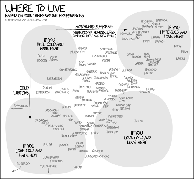
Hace aproximadamente un año, inspirados por el siguiente gráfico gráfico de xkcd, diferentes alternativas del mismo aparecieron en varios blogs, centradas generalmente en un país. El inicial de Maëlle Salmon para EUU, así como para España, Alemania, Países Bajos, Europa y Japón.
En primer lugar crearé mi versión para todo el mundo por continente. En segundo lugar para España incluyendo mapas con la ubicación de las ciudades.
Variables
En los gráficos y mapas vamos a emplear dos variables:
- Temperatura media en invierno
- Indice Humidex: wiki en español y en inglés.
Gráficos por continente
Creamos un gráfico para cada continente para evitar un apelotonamiento de ciudades. Dejamos la función facet_wrap, aunque cada gráfico está en un único panel, para obtener el subtítulo con el nombre del continente.
library(rvest)
library(tidyverse)
library(ggplot2)
library(ggrepel)
library(xkcd)
library(extrafont)
library(riem)

url <- "https://www.explainxkcd.com/wiki/index.php/1916:_Temperature_Preferences"
temp <- url %>%
  read_html() %>%
  html_node(xpath ='//*[@id="mw-content-text"]/div/table[2]') %>%
  html_table()

# Para reproducir mismos resultados
set.seed(2015)

# Incluimos a Estambul dentro de Europa
temp <- temp %>% mutate(Continent = replace(Continent, City == "Istanbul", "Europe"))

# Bucle por continente
cont_list <- unique(temp$Continent)
plots <- list() # Guardamos gráficos en una lista
for (i in seq_along(cont_list)) {
# Rangos de los ejes
rng <- temp %>% filter(Continent == cont_list[i])
xrange <- c(floor(min(rng$Humidex, na.rm = TRUE)/10)*10,
            ceiling(max(rng$Humidex, na.rm = TRUE)/10)*10)
yrange <- c(floor(min(rng$`Average low in coldest month (°C)`,na.rm = TRUE)/10)*10,
            ceiling(max(rng$`Average low in coldest month (°C)`, na.rm = TRUE)/10)*10)
# Gráfico por continente
plot <- temp %>% filter(Continent == cont_list[i]) %>%
  ggplot(aes(Humidex, `Average low in coldest month (°C)`)) +
  geom_point() +
  geom_text_repel(aes(label = City),
                  family = "xkcd",
                  max.iter = 50000) +
  facet_wrap( ~ Continent) +
  ggtitle("Where to live\nbased on your temperature preferences",
          subtitle = "Data source: www.explainxkcd.com") +
  xlab("Humidex: summer heat and humidity") +
  ylab("Avg. winter temperature in Celsius") +
  xkcdaxis(xrange = xrange,
           yrange = yrange) +
  scale_x_continuous(breaks = seq(min(xrange), max(xrange), by = 10)) +
  scale_y_continuous(breaks = seq(min(yrange), max(yrange), by = 10)) +
  theme_xkcd() +
  theme(text = element_text(size = 16, family = "xkcd")) +
  theme(text = element_text(size = 16, family = "xkcd"))
plots[[i]] = plot
print(plot)
}


España
# Importamos nombres de aeoropuertos españoles
url <- "https://es.wikipedia.org/wiki/Anexo:Aeropuertos_de_Espa%C3%B1a"
spain_airports <- url %>%
  read_html() %>%
  html_node(xpath ='//*[@id="mw-content-text"]/div/table[1]') %>%
  html_table()
spain_airports$aeropuertos <- str_extract(spain_airports$`Aeropuertos públicos`, "[^\\[]+")
# Editamos los nombres de los aeropueros manualmente
nombres <- read.csv("spain_airports_editados.csv")

# Temperaturas usando el paquete riem
summer_data <- map_df(riem_stations('ES__ASOS')$id, riem_measures,
                                date_start = "2018-06-01",
                                date_end = "2018-08-31")
winter_data <- map_df(riem_stations('ES__ASOS')$id, riem_measures,
                                date_start = "2017-12-01",
                                date_end = "2018-02-28")

# Conversión a grados centígrados
library(weathermetrics)
summer_data <- summer_data %>%
                    mutate(tmpc = convert_temperature(tmpf,
                                                      old_metric = "f",
                                                      new_metric = "c"),
                           dwpc = convert_temperature(dwpf,
                                                      old_metric = "f",
                                                      new_metric = "c"))
winter_data <- winter_data %>%
                     mutate(tmpc = convert_temperature(tmpf,
                               old_metric = "f",
                               new_metric = "c"),
                            dwpc = convert_temperature(dwpf,
                               old_metric = "f",
                               new_metric = "c"))


# Cálculo de humidex
library(comf)
summer_data <- summer_data %>%
                    mutate(humidex = calcHumx(tmpc, relh)) %>%
                   group_by(station, lon, lat) %>%
                   summarize(summer_avg_temp = mean(tmpc, na.rm = TRUE),
                      summer_humidex = mean(humidex, na.rm = TRUE))
winter_data <- winter_data %>%
                    group_by(station,lon, lat) %>%
                   summarize(winter_avg_temp = mean(tmpc, na.rm = TRUE))

# Unimos datos y nombres de aeropuertos
climate <- dplyr::left_join(winter_data, summer_data,
                             by = "station")
climate <- dplyr::left_join(climates, nombres)


# Gráfico
set.seed(2015)
xrange <- range(climate$summer_humidex)
yrange <- range(climate$winter_avg_temp)
climate %>%
  ggplot(aes(summer_humidex, winter_avg_temp)) +
  geom_point() +
  geom_text_repel(aes(label = toupper(aeropuertos) ),
                  family = "xkcd",
                  max.iter = 50000) +
  ggtitle("Where to live in Spain based on your temperature preferences",
          subtitle = "Data from airport weather stations 2017-2018") +
  xlab("Humidex: summer heat and humidity") +
  ylab("Avg. winter temperature in Celsius") +
  xkcdaxis(xrange = xrange,
           yrange = yrange) +
  theme_xkcd() +
  theme(text = element_text(size = 16, family = "xkcd")) +
  theme(text = element_text(size = 16, family = "xkcd"))

Mapas de España
Muestro dos tipos de gráfico. El invierno con una paleta basada en un color azul y el verano con la escala viridis. En este caso no disponemos de una tabla con las temperaturas, por lo que usamos el paquete riem (“R Iowa Environmental Mesonet”) creado por Maëlle Salmon que extrae la información de aquí.
Invierno
# Península
set.seed(2015)
climate_spain_map %>%
  filter(lon > -10) %>%
  ggplot(aes(lon, lat)) +
  geom_point(aes(color = winter_avg_temp), size = 3.5) +
  geom_text_repel(aes(label = aeropuertos),
                  family = "xkcd", size = 4.5,
                  max.iter = 50000) +
  geom_polygon(data = spain, aes(x = long, y = lat, group = group),
               fill = NA, color = "black") +
  coord_map() +
  labs(title = "Avg. Winter Temperature in Spain",
       subtitle = "Data from Iowa Environment Mesonet 2017-2018",
       x = "", y = "") +
  theme_xkcd() +
  theme(axis.text.x=element_blank(),
        axis.ticks.x=element_blank(),
        axis.text.y=element_blank(),
        axis.ticks.y=element_blank())+
  scale_color_gradient(low = "#08306B")

# Canarias
canary <- map_data(map = "world", region = "Canary Islands")
climate_canary_map <- left_join(climates, lat_lon, by = "station")

set.seed(2015)
climate_canary_map %>%
  filter(lon < -10) %>%
  ggplot(aes(lon, lat)) +
  geom_point(aes(color = winter_avg_temp), size = 3.5) +
  geom_text_repel(aes(label = aeropuertos),
                  family = "xkcd", size = 4.5,
                  max.iter = 50000) +
  geom_polygon(data = canary, aes(x = long, y = lat, group = group),
               fill = NA, color = "black") +
  coord_map() +
  labs(title = "Avg. Winter Temperature in Canary Islands",
       subtitle = "Data from Iowa Environment Mesonet 2017-2018",
       x = "", y = "") +
  theme_xkcd() +
   theme(axis.text.x=element_blank(),
        axis.ticks.x=element_blank(),
        axis.text.y=element_blank(),
        axis.ticks.y=element_blank()) +
  scale_color_gradient(low = "#08306B")


# Península
set.seed(2015)
climate_spain_map %>%
  filter(lon > -10) %>%
  ggplot(aes(lon, lat)) +
  geom_point(aes(color = summer_humidex), size = 3.5) +
  geom_text_repel(aes(label = aeropuertos),
                  family = "xkcd", size = 4.5,
                  max.iter = 50000) +
  geom_polygon(data = spain, aes(x = long, y = lat, group = group),
               fill = NA, color = "black") +
  coord_map() +
  labs(title = "Avg. Summer Humidex in Spain",
       subtitle = "Data from Iowa Environment Mesonet 2017-2018",
       x = "", y = "") +
  theme_xkcd() +
  theme(axis.text.x=element_blank(),
        axis.ticks.x=element_blank(),
        axis.text.y=element_blank(),
        axis.ticks.y=element_blank()) +
    scale_color_viridis_c()

# Canarias
set.seed(2015)
climate_canary_map %>%
  filter(lon < -10) %>%
  ggplot(aes(lon, lat)) +
  geom_point(aes(color = summer_humidex), size = 3.5) +
  geom_text_repel(aes(label = aeropuertos),
                  family = "xkcd", size = 4.5,
                  max.iter = 50000) +
  geom_polygon(data = canary, aes(x = long, y = lat, group = group),
               fill = NA, color = "black") +
  coord_map() +
  labs(title = "Avg. Summer Humidex in Canary Islands",
       subtitle = "Data from Iowa Environment Mesonet 2017-2018",
       x = "", y = "") +
  theme_xkcd() +
   theme(axis.text.x=element_blank(),
        axis.ticks.x=element_blank(),
        axis.text.y=element_blank(),
        axis.ticks.y=element_blank()) +
   scale_color_viridis_c()


Entradas relacionadas


 Nube de datos